Product Label Design for Foley’s Frothing Fermentations Sauerkraut
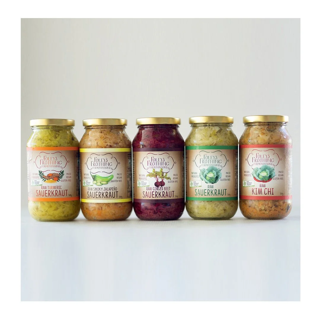
West Australian grown and West Australian made, Foley’s Frothing Fermentations is a truly grassroots local business boasting health foods with a hand-made touch - and that is just what the label design needed to reflect. We played with illustrated images of the core ingredients, bright colours to differentiate flavours, and a lighthearted hand-drawn style font to speak hand-made, health and fun. It’s said that you have about 3 seconds to attract the attention of a buyer to your label. For this reason the design must ensure clear readability including the brand name, the product name, and a 2-3 word description of the product.
Foley’s Frothing Fermentations
Raw Ginger Beet
SAUERKRAUT
The rest of the information can be found, but need not dominate the design.
Standing out on the already busy supermarket shelves can be a challenge, so your brand style needs to speak volumes on the label design.